How I made my thesis cover using Adobe Illustrator.
How I made my thesis cover using Adobe Illustrator.

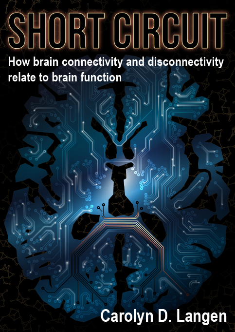
After a year of working on my PhD in my spare time I have finally sent it to the printers. What a relief! One of the most fun parts of making my thesis was making my own cover using Adobe Illustrator. I chose Illustrator because I wanted to make a vector graphic that would scale well and because it offers many sophisticated features. Also, since I am still not done my PhD I could get the entire Adobe suite of products for a good price via my university. Plus, I love learning how to use new tools. In this post I will simultaneously show the cover off and describe how I did it. So without further delay, I present to you my thesis cover (queue applause):

Almost everyone I have shown it to said that it looks like the cover of a science fiction book. GOOD! Although SciFi is not my genre of choice, I was indeed aiming for something in that direction. The brain is the inspiration for several types of AI [1,2], which have in turn inspired many SciFi plot lines. The brain is arguably the coolest and most mysterious organ. Below I’ll outline the steps I took to make my thesis cover.
How it was made
Circuit board
The focal point of my thesis cover is a circuit board in the shape of the brain. To make it, I first needed a suitable image to start from. My criteria were that the image needed be a cross-section of the brain which (1) included as many brain regions as possible; and (2) used a limited set of colors without shading (i.e. grey and white matter should each be filled in with exactly one color). I used some common neuroimaging tools / datasets to produce this image. For those that are familiar with neuroimaging tools, this specifically involved using fslview to export an image of an fsaverage FreeSurfer segmentation (I can’t remember which one I used, but I only really needed grey and white matter for this project). Once I had my image, I imported it into Illustrator and used Image Trace to vectorize the grey and white matter regions. I then grouped regions into (1) cortex; (2) subcortical; and (3) white matter. The vectorized image looked like this:
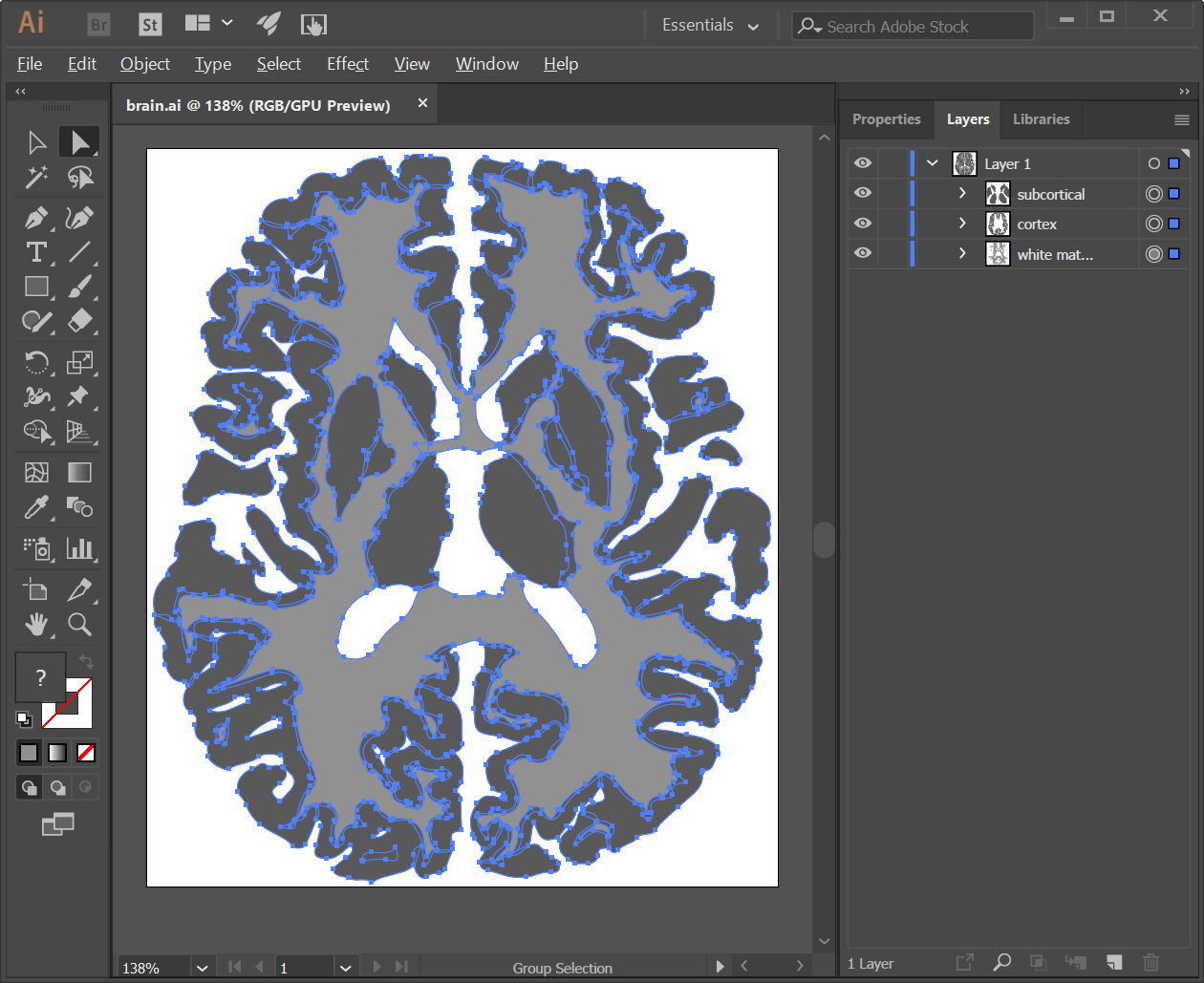
I duplicated the white matter and subcortical groups, set their fill to None and their line color to white. This served as a guide to show where the tissue borders were, but they were set to invisible for the final version. The original groups were merged into one to form the shape of the circuit board. I then removed points in the outline to make the edges a bit more angular. I also set the background to black.

I then followed the first seven steps of this guide to both color the circuit board and to draw the circuitry, changing the colors and gradients as I saw fit. I used the tissue border outlines to help decide where to put the terminal ends of each circuit path. I generally tried to keep the ends in the grey matter, and the majority of the path in the white matter.

I wanted to capture the fact that the brain is dynamic. It is constantly transmitting signals between brain regions throughout our entire lives. To show the movement of signal, I made a white circle with a diffuse outer glow.

Single neural signal
I added trailing light by making a path and coloring it with a gradient. The gradient that I used was white with 80% opacity on one end and 0% opacity on the other. I had to adjust the angle of the gradient depending on the orientation of each trailing light.
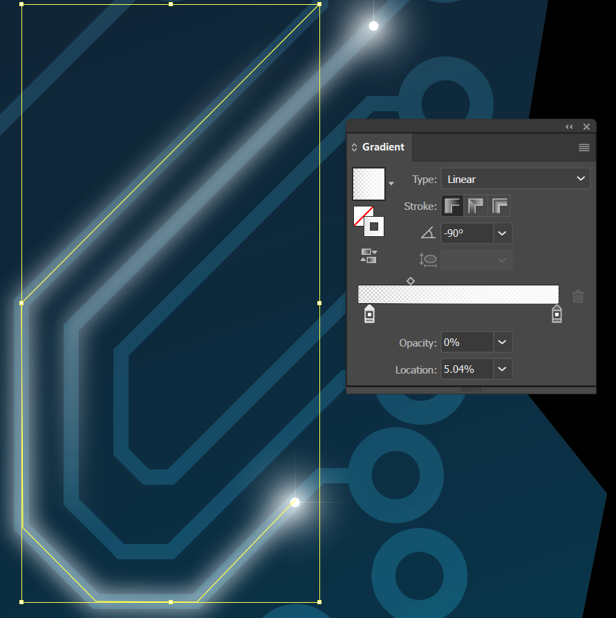
Trailing light of neural signal
I also attempted to capture the concept of “disconnection” in the brain by adding in some circuitry that (hopefully) appears to be glowing. The idea being that some kind of pathology, such as a white matter lesion, is causing a short circuit and destroying the circuitry. Based on feedback I’m not sure I was successful in conveying this idea, but on the level of visual appeal I got positive feedback. To achieve the look I added a gradient to several paths, which went from black, to orange, to yellow, to white. The positioning of each color in the gradient and the angle was adjusted depending on which path was selected.
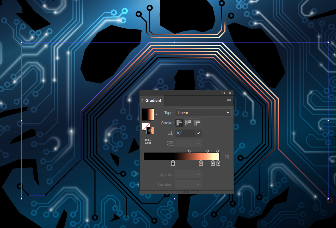
Pathological circuitry
And that is about it for the circuit board!
Text
I wanted my text to stand out over top of the image. I opted to keep the appearance of the subtitle and my name simple by making them uniformly white and using a standard font (Arial, Narrow Bold). To make the main title (Short Circuit) pop, I filled it with black and made the outline of the letters light yellow. I added an orange outer glow and applied a Gaussian Blur.
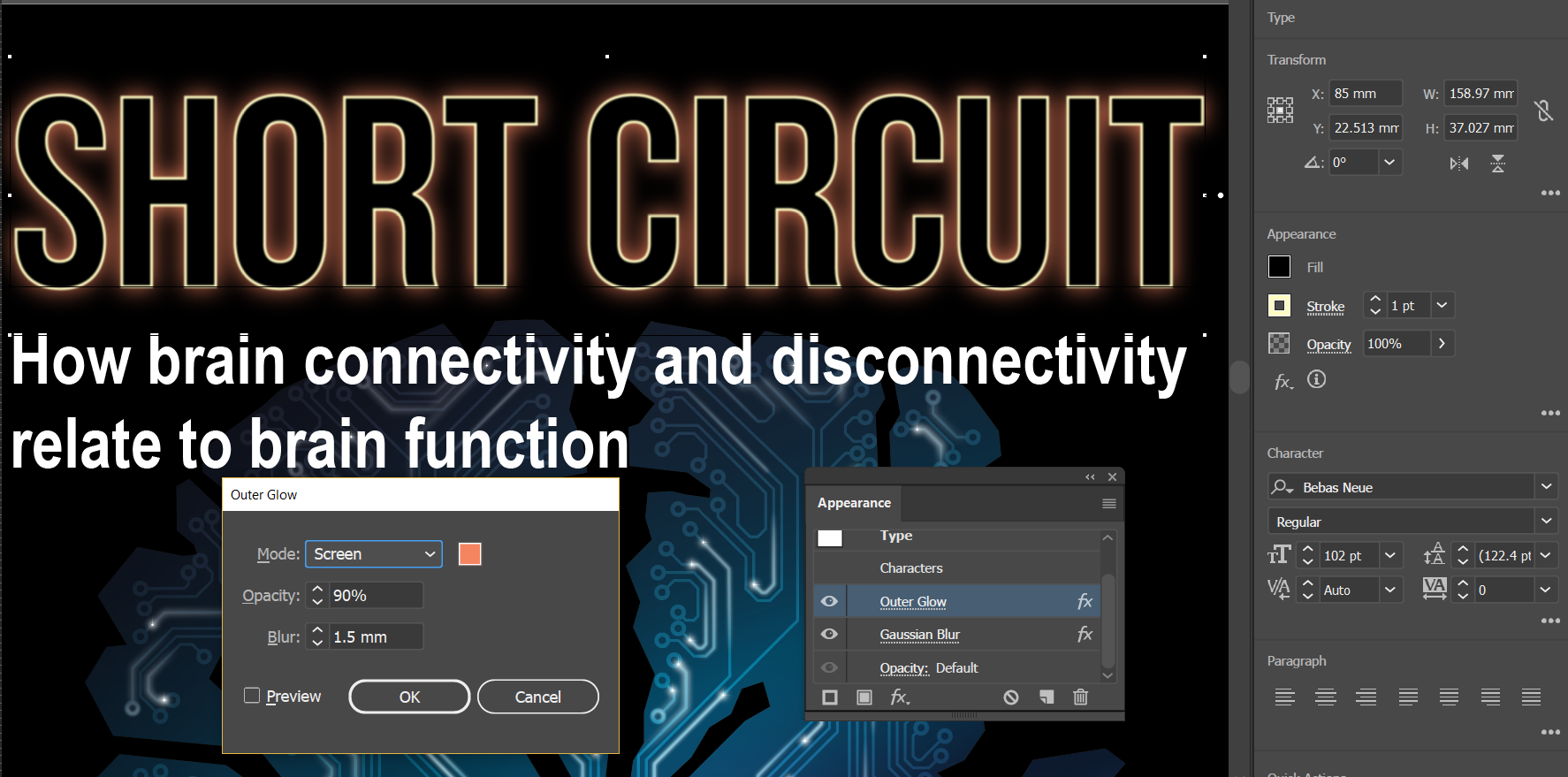
Making the title pop
Graph background
The final element of my cover was a graph in the background. When I exported the cover to png for this post, the graph seems to have become much more subtle, so I’ll show what it looks like over the whole cover with the colors brightened (back, spine, front – the white outlines show the borders of the back and front artboards).
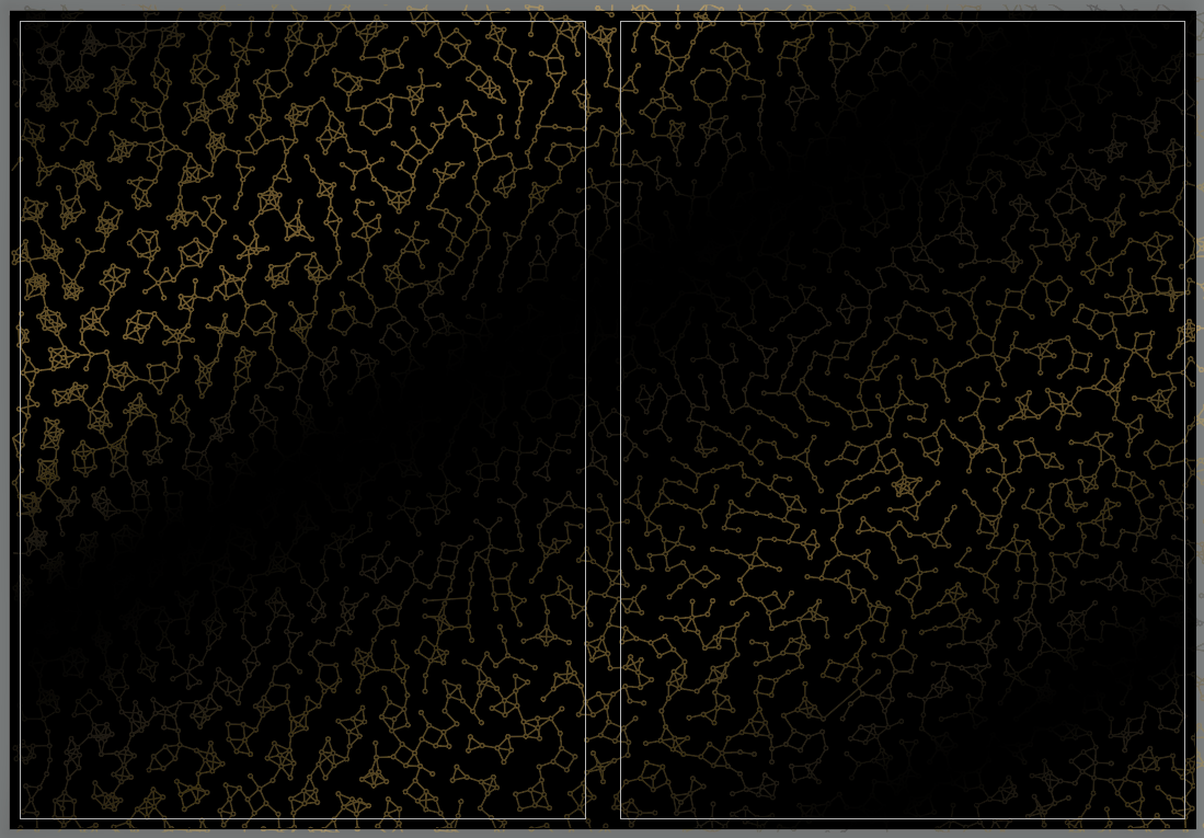
Graph background
I originally generated the graph using the Python networkx package. I wanted to share it but I didn’t put it in a repository and lost the files (doh!).
The inner cover page
I also needed to make an inner cover page (i.e. the first page that you see when you open a book). I wanted it to be monochrome black to reduce the number of color pages in the book and to make it distinct from the main cover. So I copied the circuit, made the board black with a white outer glow and made the circuitry a shade of grey. I copied the title and made the outline and outer glow white. I copied the subtitle and author lines and adjusted their size and alignment appropriately. And voila! I had a nice inner cover to use.
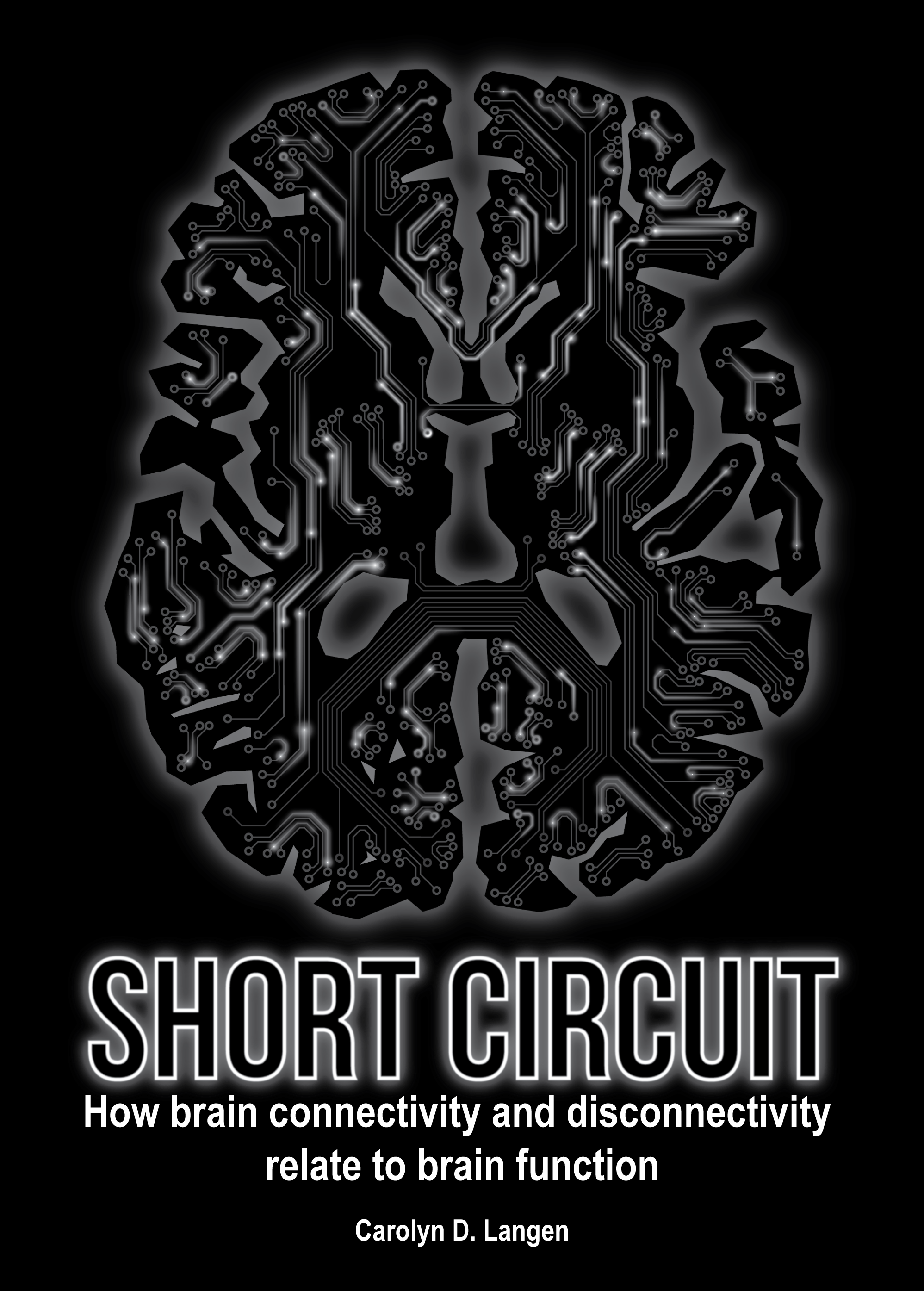
I must be honest that I like the simplicity of this black and white image so much that I am torn between whether I like the inner or outer cover better.
Pulling the rest of the thesis together
I did the layout of my thesis using LaTeX. I started from a template provided by a colleague and changed the class file until the book looked how I wanted it to. I must admit that I am not a LaTeX aficionado. This was a laborious process of googling, applying what I found and trying variations until the result was acceptable to me. The fact that I didn’t completely know what I was doing became evident when some heading text in my summary changed. They were initially generated by a code, so I simply replaced it with hard-coded text. I’m happy with how my thesis looks, but clearly I need to give the contents a careful look to make sure all references are ok. Live and learn I guess.
The text is organized in chapters and parts. To have done visual continuity I designed the two pages separating the parts and chapters using elements from the cover. For the chapters I reused the graph that I generated for the background of the cover, changing the color scheme to grey on white.
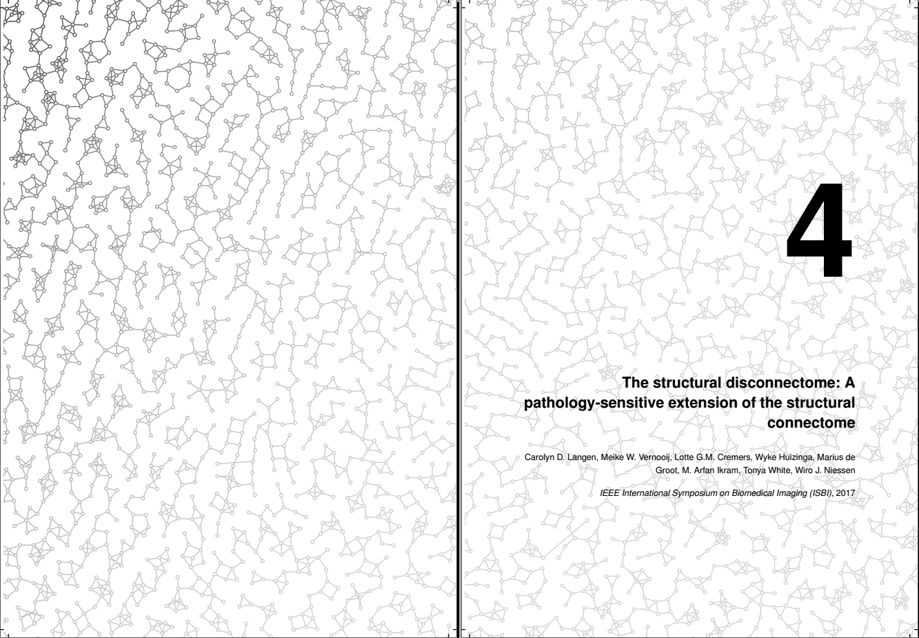
For the part divider I reused the title font on top of a background image which was generously provided by Greg A Dunn and Brian Edwards (Cortical Circuitboard, 22K reflective microetching, 2013-4).
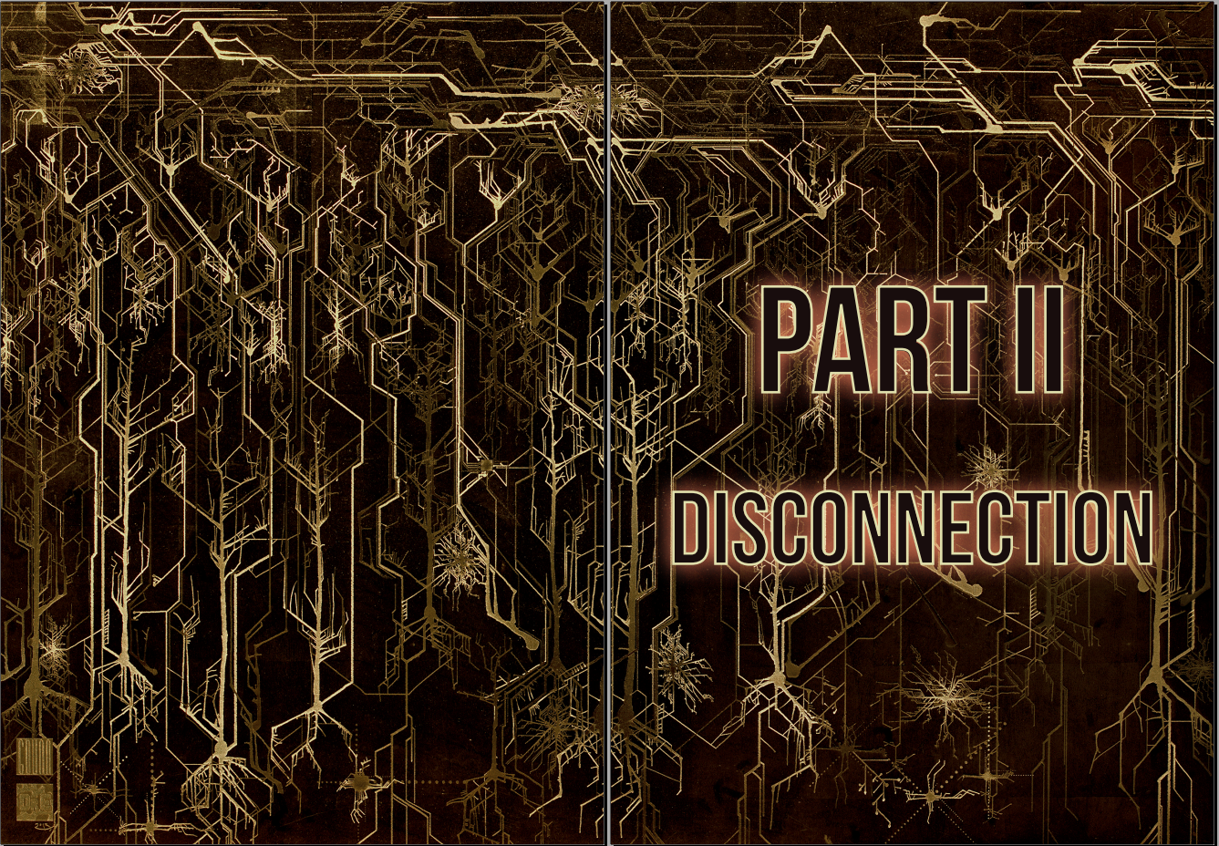
So there you have it. That is how I designed the cover of my book and some of the artwork on the inside. To anyone wanting to design their own thesis cover, I wish you the best of luck and I hope that your experience will be as positive as mine was.